Redesign for the non-profit GoFarm, a food subscription service that provides patrons with fresh, organic, and locally grown produce.
Users struggle to understand what a food share is, how it works, and the impact their subscription and potential donation has.
Improved the visibility of mission, programs, donation impact and create an easier and more enjoyable food share checkout experience that increases people’s willingness to donate.
Group Project
Adobe XD, Miro
3 weeks
UX Designer
GoFarm is a non-profit dedicated to providing fresh and local produce at an affordable price. Our group worked with their marketer to redesign their MVP: the food share subscription checkout process.
Our main goal was to make the food share checkout process feel intuitive, easy, and quick. Our second goal was to increase the number of donations within this checkout experience. We achieved these goals by re-designing their homepage, re-ordering checkout steps, lowering the donation amount bar, and increasing donation transparency.
Jump to PrototypeThis project began as a bootcamp design prompt: in a group, re-design a local non-profit website with their input and business insights. Our group choose GoFarm.
What is GoFarm?
A Colorado-based non-profit organization working to transform our local food system for the past 6 years. They sponsor beginning and established Colorado farmers, increase access to fresh food in under-resourced communities, and run a food share subscription service.
GoFarm has a responsive-ish website that centers around 3 main actions.
Connecting the Community to Local Agriculture though a Multi-Farm Community Supported Agriculture (CSA) program.
Helping Beginning Farmers Start Their Own Farm and Supporting Existing Local Farmers.
Donating ensures GoFarm’s programs thrive and establish an environmentally sustainable, and equitable food system.
Improve GoFarm’s food share checkout experience so first-time food share subscribers can quickly and easily purchase a food share and understand why they should donate?
Before beginning any design work we met with the stakeholder (marketing manager and website monitor) via zoom with the goal of agreeing to a unified vision for the website and shared understanding of user needs.
01
User Needs
02
Business Needs
03
Business Insights
Our team only had 3-4 weeks to complete this redesign. Because of the time constraint, we decided to focus on redesigning GoFarm’s highest traffic pages and biggest MVP: the food share subscription process.
To dig deeper into user needs, we conducted 7 guerrilla-style usability tests to get a feel for how people navigate the website, how they sign up for a food share, and the find-ability of key business information such as mission and programs.
Users didn't understand the significant impact donations have on GoFarm's programs, outreach, and success.
Huge Problem! 5/7 users struggled to quickly relay what GoFarm did, what a food share was and how it worked.
3/7 users missed the CTA “sign up for food share” located on the hero image. The food share purchase process did not feel intuitive.
User’s path to food share subscription typically begins with the homepage. However, this page particularly on mobile was very content-heavy. This meant people skipped or missed key information on GoFarm’s mission, programs, community value as well as the food share subscription button.
During usability testing, we noticed the food share subscription process was cumbersome, awkward, and lengthy.
First, the login/create an account "broke up" the subscription process. It was an unexpected, high effort task right before users were about to enter payment information at the end of an already lengthy subscription process.
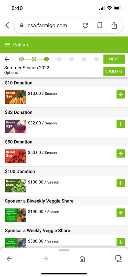
Second, we struggled with when should users be asked to donate. We conducted A/B testing to discover whether users preferred to donate before or after they select their payment option.
GoFarm relies heavily on donations to maintain its services for farmers and subscribers. However, they have a hard time getting people to donate! During usability testing, we surmised this might be due to the fact people don't want to spend more money after an expensive food share purchase.
Each team member played a part in designing the prototype. Once each team member sketched their own wireframes depicting the food share checkout process and donation step, we met over Zoom and on Miro (simultaneously) to pick the strongest features and design decisions from each of our wireframes to create 1 clickable prototype (see below).
Each sticky note color represents one group member's thoughts, likes, and suggestions.
Jane is a first time food share subscriber wanting to know more about GoFarm and buy a food share.
She scrolls down on the homepage to learn more about what GoFarm does.
As Jane continues to scroll, she comes across GoFarm's Programs. Swiping rotates the "wheel" revealing a different program's description.
Once Jane has selected her pickup location, she chooses her desired food share(s).
First, Jane selects veggie share and then selects the size or number of veggie items she would like to receive.
Lastly, she selects how often she would like to receive her food share.
Jane is ready to check out. She selects a payment option.
She is then asked if she would like to make a one-time donation.
She reviews her payment and is asked if she would like to round up her total as a small donation.
One of my biggest revelations from this project was the power of collaboration! Creating a mobile prototype with four minds was (at times) challenging, however, the process of getting there was one I greatly enjoyed. Best of all, I feel we ended with a product that is not only a combination of our best ideas but something that improves a user's experience on GoFarm. They can understand GoFarm’s mission, better understand the impact a donation has on the company, and sign up for a food share with ease!